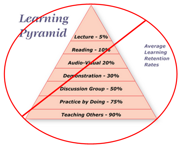
I was listening to a training session given by a client last week. The trainer was encouraging his sales people to work harder at educating customers. He mentioned that people retain more information when they are involved in an activity by ‘doing.’ He then cited this learning pyramid.

This pyramid tells a very compelling story. After a lecture we can only be expected to retain 5% of what we hear. We can retain 10% of what we read, etc. Ultimately the pyramid reminds us that the best way to master a topic is to learn to teach it. The more involved we get with the content the more mastery we have over it.
That all makes intuitive sense. And the pyramid is all over the internet. Search on ‘retention rate learning’ and click on the ‘images’ tab and you’ll see over 700,000 results, many of which are of this pyramid.
So it makes sense, everyone knows it, and the data is all over the internet. It’s got to be true, right?
Problem. Just think a bit deeper about this. How does the pyramid define ‘lecture’? Are they referring to a lecture given by Steve Jobs? I bet people retain a lot more than 5% of what he says. Or are they referring to a lecture given by me? I can assure you my own kids retain nothing of what I lecture them about! And how is it that the data is so clean. Isn’t the mathematical progression wonderful? And really, if I teach someone something I am going to retain 90% of the information? If only it were so easy.
Googling around, I found several articles that investigated further. See the excellent articles on ‘myths and misconceptions’. And see another excellent critique of the pyramid as well. Those articles do a pretty good job of debunking the pyramid.
It is unfortunate that a chart like this gets so popular despite its lack of a reference, and despite it being so clean that it ought to immediately make people skeptical. So first, this post is a plea for people to be careful about the kind of data they consume.
But more importantly, it suggests a hierarchy for learning that is completely false and I’d suggest that it is not only misleading, but also harmful. It suggests that there is a best way to teach something. 90% is better than 5%, so shouldn’t all education lead towards a student teaching something?
Education is an art form. Each level of the pyramid describes a tool that great teachers can use. The selection of a tool is dependent on the need of the students and is complicated by so many variables that a simplification like this pyramid sends a very wrong message.
The message that should be sent is that any teaching method can be good and it can also be bad. Then the educator can focus on improving his or her ability to deliver that lecture in a way that assures the deep engagement of the participant.
Some takeaways:
- if data looks really neat and pretty, be skeptical. Smart people are able to carry both sides of an argument in their heads and this brings a healthy level of cynicism to a chart like the pyramid.
- a teaching method can be good or bad, depending on how that method is applied.
- good instruction can involve a variety of methods.
- learning is a very complex subject and should be treated accordingly. There is seldom a best method.
- teaching is an artful blend of a variety of methods.
Great teachers are artists, and art does not come from a formula. If it did, my paint-by-numbers would likely hang in the Met, rather than my parent’s closet…..


